Unit:
SpTBXItem
Hierarchy:
TTBCustomItem - TSpTBXCustomItem - TSpTBXItem
Description:
TSpTBXItem extends TTBItem with support for unicode hints and caption, custom item size, custom painting events and skin painting
It adds the following properties and events:
Published:
- property Alignment: TAlignment;
TAlignment = (taLeftJustify, taRightJustify, taCenter);
Controls the horizontal placement of the caption. Set Alignment to specify how the caption is justified within the ClientRect of the item.
- property Anchored: Boolean;
Specifies if the item is anchored. The item should be placed on a TSpTBXToolbar with Stretched setted to True, and ShrinkMode setted to tbsmNone.
You can also anchor dropped controls on the toolbar.
- property CaptionGlow: Boolean;
Specifies if the caption outline is painted or not.
- property CaptionGlowColor: TColor;
Specifies the caption outline color.
- property Control: TControl;
Specifies the associated visibility toggle control. The checked property toggles the visibility of the control, use this property instead of using the TTBXVisibilityToggleItem.
- property CustomWidth: Integer;
Determines the item width. If the property is setted to -1 the item is autosized.
- property CustomHeight: Integer;
Determines the item height. If the property is setted to -1 the item is autosized.
- property FontSettings: TSpTBXFontSettings;
Specifies the font properties that are used to paint the caption.
- property Wrapping: TTextWrapping;
TTextWrapping = (twNone, twEndEllipsis, twPathEllipsis, twWrap);
Determines the item caption wrapping.
- OnDrawCaption (Sender: TObject; ACanvas: TCanvas; ClientAreaRect: TRect; var ACaption: WideString; var CaptionRect: TRect; IsTextRotated: Boolean; const PaintStage: TSpTBXPaintStage; var PaintDefault: Boolean)
Occurs when the item needs to paint the caption, the PaintStage indicates the current stage in the drawing process. DefaultDraw indicates whether the item should continue with the default painting after the event handler exits. Set DefaultDraw to false to prevent the drawing of the item after the event handler exits. If DefaultDraw remains set to true, the item continues with the default painting
process.
More info on custom painting events
- OnDrawHint (Sender: TObject; AHintBitmap: TBitmap; var AHint: WideString; var PaintDefault: Boolean);
Occurs when the item needs to paint the hint, AHintBitmap represents the hint canvas, it can change the size, font, and background colors. AHint is the hint text to be painted, and PaintDefault indicates whether the control should continue with the default painting after the event handler exits. Set DefaultDraw to false to prevent the drawing of the item after the event handler exits. If DefaultDraw remains set to true, the item continues with the default painting process.
More info on custom painting events
- OnDrawImage (Sender: TObject; ACanvas: TCanvas; const ItemInfo: TTBXItemInfo; const PaintStage: TSpTBXPaintStage; AImageList: TCustomImageList; var AImageIndex: integer; var ARect: TRect; var PaintDefault: Boolean);
Occurs when the icon image needs to be painted, the PaintStage indicates the current stage in the drawing process. DefaultDraw indicates whether the item should continue with the default painting after the event handler exits. Set DefaultDraw to false to prevent the drawing of the item after the event handler exits. If DefaultDraw remains set to true, the control continues with the default painting process.
More info on custom painting events
- OnDrawItem (Sender: TObject; ACanvas: TCanvas; ARect: TRect; const PaintStage: TSpTBXPaintStage; var PaintDefault: Boolean);
Occurs when the item needs to be painted, the PaintStage indicates the current stage in the drawing process. DefaultDraw indicates whether the item should continue with the default painting after the event handler exits. Set DefaultDraw to false to prevent the drawing of the item after the event handler exits. If DefaultDraw remains set to true, the control continues with the default painting process.
More info on custom painting events
|
Unit:
SpTBXItem
Hierarchy:
TTBCustomItem - TSpTBXCustomItem - TSpTBXItem - TSpTBXSubmenuItem
Description:
TSpTBXSubmenuItem extends TTBSubmenuItem with support for unicode hints and caption, custom item size, custom painting events and skin painting.
TSpTBXSubmenuItem inherits many properties, methods, and events from TSpTBXItem; see its help topic for details on the properties, methods, and events not listed here.
Published:
- property DropdownCombo: Boolean;
When True the item will behave as a both clickable button and a dropdown menu. Clicking on the left side generates an OnClick event, clicking on the right side of the button generates an OnPopup event and displays the dropdown menu
- property HideEmptyPopup: Boolean;
When
the submenu has no items and this property is set the
popup window will not be showed.
- property ToolbarStylePopup: Boolean;
When True it displays the sub items as a horizontal toolbar.
- property ToolBoxPopup: Boolean;
Determines if the popup items are rendered with toolbar style, for example use this property when you want to create a color-picker style popup using the TSpTBXColorPallette item.
|
Unit:
SpTBXItem
Hierarchy:
TTBSeparatorItem - TSpTBXSeparatorItem
Description:
TSpTBXSeparatorItem is a replacement for TTBSeparatorItem that supports skin painting. |
Unit:
SpTBXItem
Hierarchy:
TTBCustomItem - TSpTBXCustomItem - TSpTBXCustomLabelItem - TSpTBXRightAlignSpacerItem
Description:
TSpTBXRightAlignSpacerItem is a spacer used to right align items.
Right alignment only works on TSpTBXToolbar with Stretched setted to True, and ShrinkMode setted to tbsmNone. |
Unit:
SpTBXItem
Hierarchy:
TTBCustomItem - TSpTBXCustomItem - TSpTBXCustomLabelItem - TSpTBXLabelItem
Description:
TSpTBXLabelItem extends TTBLabelItem with support for unicode hints and caption, custom item size, custom painting events and skin painting.
TSpTBXLabelItem inherits many properties, methods, and events from TSpTBXItem; see its help topic for details on the properties, methods, and events not listed here. |
Unit:
SpTBXItem
Hierarchy:
TTBGroupItem - TSpTBXSkinGroupItem
Description:
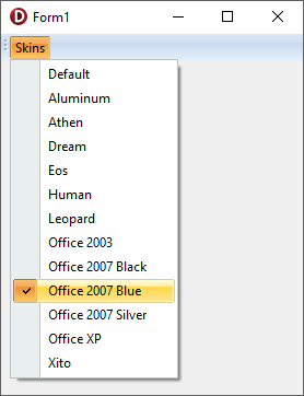
TSpTBXSkinGroupItem is a group item that expands into multiple items which list all the available skins, and let the user switch between them. The list is expanded at runtime only.
The TSpTBXSkinGroupItem can be placed inside a submenu item for better results.
It adds the following methods, properties and events:
Public:
- procedure Recreate;
Recreates the list of skins items.
- property DefaultIndex: Integer;
Index where the list of theme items should be inserted. The group item can have previously setted items.
Published:
- OnClick (Sender: TObject);
Event fired when a theme item is checked.
- OnGetCaption (Sender: TObject; var ThemeName: WideString);
Use this event to rename the theme items.
- OnSkinChange (Sender: TObject);
Occurs when the active skin is changed.
- OnUpdate (Sender: TObject);
Event fired when the theme item list is recreated.
|
Unit:
SpTBXTabs
Hierarchy:
TTBCustomItem - TSpTBXCustomItem - TSpTBXTabItem
Description:
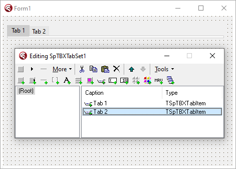
TSpTBXTabItem represents a tab on a tab based control, like TSpTBXTabSet or TSpTBXTabControl.
TSpTBXTabItem inherits many properties, methods, and events from TSpTBXItem; see its help topic for details on the properties, methods, and events not listed here.
Public:
- function GetNextTab(GoForward: Boolean; SearchType: TSpTBXSearchItemViewerType): TSpTBXTabItem;
Function that returns the previous or next tab item in the tab set.
- function IsFirstVisibleTab: Boolean;
Returns true if it's the first tab in the tab set.
- function IsLastVisibleTab: Boolean;
Returns true if it's the last tab in the tab set.
- procedure TabClose;
Closes the tab. When a tab is closed it is not deleted nor freed, it's just hidden.
Published:
- property SkinType: TSpTBXSkinType;
TSpTBXSkinType = (sknNone, sknWindows, sknSkin);
Determines the control skin painting. When SkinType is sknNone no skin is used and the control is painted using the standard Win32 controls style. If it's setted to sknWindows uses the WinXP theme when available and sknSkin uses the active skin to paint the control.
This property is read-only when placed on a tab based control like TSpTBXTabSet or TSpTBXTabControl.
- OnDrawTabCloseButton (Sender: TObject; ACanvas: TCanvas;
State: TSpTBXSkinStatesType; const PaintStage: TSpTBXPaintStage;
var AImageList: TCustomImageList; var AImageIndex: Integer;
var ARect: TRect; var PaintDefault: Boolean);
Occurs when the close button image needs to be painted, the PaintStage indicates the current stage in the drawing process. DefaultDraw indicates whether the item should continue with the default painting after the event handler exits. Set DefaultDraw to false to prevent the drawing of the item after the event handler exits. If DefaultDraw remains set to true, the control continues with the default painting process.
More info on custom painting events
- OnTabClose (Sender: TObject);
Occurs when the tab is closed.
- OnTabClosing (Sender: TObject; var Allow: Boolean);
Occurs when the tab is about to be closed.
|
Unit:
SpTBXEditors
Hierarchy:
TTBCustomItem - TTBEditItem - TSpTBXEditItem
Description:
TSpTBXEditItem extends TTBEditItem with support for unicode hints and caption, custom item size, custom painting events and skins.
TSpTBXEditItem inherits many properties, methods, and events from TTBEditItem; see its help topic for details on the properties, methods, and events not listed here.
Published:
- property EditImageIndex: TImageIndex;
Specifies the icon image that should be painted
on the left of the EditCaption when the item is on a menu.
|
Unit:
SpTBXEditors
Hierarchy:
TTBCustomItem - TTBEditItem - TSpTBXEditItem - TSpTBXSpinEditItem
Description:
TSpTBXSpinEditItem is a spin edit toolbar item with support for unicode hints and caption, custom item size, custom painting events and skins painting.
TSpTBXSpinEditItem inherits many properties, methods, and events from TSpTBXEditItem; see its help topic for details on the properties, methods, and events not listed here.
Published:
- property SpinOptions: TSpTBXSpinEditOptions;
Property that holds the spin edit options, refer to TSpTBXSpinEditOptions for more info.
- property Value: Extended;
This property conains the numeric value displayed by the control in floaging point format.
When ValueType if set to evtInteger or evtHex, the Value property is automatically rounded to the nearest integer. In this case it may also be convenient to access the numeric value using the AsInteger property.
- OnValueChanged (Sender: TObject);
Occurs when the value property is changed.
|
Unit:
SpTBXItems
Hierarchy:
TTBCustomItem - TSpTBXCustomItem - TSpTBXCustomToolPalette - TSpTBXToolPalette
Description:
Tool palettes contain a grid of cells, each acting as a separate subitem. Notice however, that each tool palette is a single toolbar item and the cells are not the same toolbar items as the child items in a SubmenuItem.
The images displayed in each cell are obtained from the Images property. By default, the upper left cell gets the image with index 0, the second cell in this row has index 1, etc.
It implements the following properties and events:
Public:
- property SelectedCell: TPoint;
Returns the selected cell position.
Published:
- property ColCount: Integer;
The number of columns on the grid.
- property RowCount: Integer;
The number of rows on the grid.
- OnChange (Sender: TObject);
OnChange is fired each time when the SelectedCell property changes.
- OnCellClick (Sender: TObject; ACol, ARow: Integer; var Allow: Boolean);
Handle this event to respond to changes in the selection initiated by user. In addition, you can customize the cell selectivity by altering the AllowChange parameter.
- OnDrawCellImage (Sender: TObject; ACanvas: TCanvas;
ARect: TRect; ACol, ARow: Integer; Selected, HotTrack, Enabled: Boolean);
Occurs when the cell needs to be painted.
- OnGetCellHint (Sender: TObject; ACol, ARow: Integer; var AHint: WideString);
In OnGetCellHint event handler, you can customize the hint string appearing next to each item in the palette. This event will be regularly fired by the tool palette while the mouse is moved from one cell to another.
|
Unit:
SpTBXItems
Hierarchy:
TTBCustomItem - TSpTBXCustomItem - TSpTBXCustomToolPalette - TSpTBXColorPalette
Description:
TSpTBXColorPalette is a tool palette descendant modified to display a color palette.
TSpTBXColorPalette inherits many properties, methods, and events from TSpTBXToolPalette; see its help topic for details on the properties, methods, and events not listed here.
Public:
- function FindCell(AColor: TColor): TPoint;
Finds the position of a color in the grid.
Published:
- property ColCount: Integer;
The number of columns on the grid when CustomColors is False.
- property Color: TColor;
The selected Color, clNone if there's no color selected.
- property CustomColors: Boolean;
When True it will use custom colors obtained using the OnGetColor event. When False it will use the default colors on a 8x5 grid.
- property RowCount: Integer;
The number of rows on the grid when CustomColors is False.
- OnGetColor (Sender: TObject; ACol, ARow: Integer; var Color: TColor; var Name: WideString);
Use this event to fill the grid with custom colors. The Name param is used when the hint of the cell must be displayed.
|
Unit:
SpTBXMDIMRU
Hierarchy:
TTBCustomItem - TSpTBXMRUListItem
Description:
TSpTBXMRUListItem is a replacement for TTBMRUListItem that has unicode support and skinning.
The use of a TTBMRUList is not needed.
It implements the following properties and events:
Public:
- procedure GetMRUFilenames(MRUFilenames: TStrings);
Returns the list of MRU Filenames.
- function IndexOfMRU(Filename: WideString): Integer;
Returns the index of the MRU item that is associated with the Filename param.
- procedure MRUAdd(Filename: WideString);
Adds a Filename to the MRU list.
- function MRUClick(Filename: WideString): Boolean;
Clicks the MRU item that is associated with the Filename param.
- procedure MRURemove(Filename: WideString);
Deletes a Filename from the MRU list.
- procedure MRUUpdateCaptions;
Updates the captions of the MRU list.
- procedure LoadFromIni(Ini: TCustomIniFile; const Section: string);
Loads the MRU list from an INI file.
- procedure SaveToIni(Ini: TCustomIniFile; const Section: string);
Saves the MRU list to an INI file.
Published:
- property HidePathExtension: Boolean;
When True, pathnames and file extensions will be hidden when the items are displayed. If your MRU list doesn't contain filenames, this property should be changed to False.
- property MaxItems: Integer;
The maximum number of items the list may contain.
- property OnClick (Sender: TObject; const Filename: WideString);
Event fired when a MRU item is clicked.
|
Unit:
SpTBXMDIMRU
Hierarchy:
TTBCustomItem - TSpTBXMDIWindowItem
Description:
TSpTBXMDIWindowItem is a replacement for TTBMDIWindowItem that has unicode support and skinning. |
|
|
