|
Unit:
SpTBXItem
Hierarchy:
TTBDock - TSpTBXDock
Description:
TSpTBXDock extends TTBDock with support for custom painting events and item alignment, it adds the following properties and events:
Published:
- OnCanResize (Sender: TObject; var NewWidth, NewHeight: Integer; var Resize: Boolean);
Occurs when an attempt is made to resize the control.
- OnDrawBackground(Sender: TObject; ACanvas: TCanvas; ARect: TRect; const PaintStage: TSpTBXPaintStage; var PaintDefault: Boolean);
Occurs when the control needs to be painted, the PaintStage indicates the current stage in the drawing process. DefaultDraw indicates whether the control should continue with the default painting after the event handler exits. Set DefaultDraw to false to prevent the drawing of the control after the event handler exits. If DefaultDraw remains set to true, the control continues with the default painting process.
More info on custom painting events
|
Unit:
SpTBXDkPanels
Hierarchy:
TTBDock - TSpTBXCustomMultiDock - TSpTBXMultiDock
Description:
TSpTBXMultiDock extends TTBDock with client aligning support, it adds the following properties and events:
Published:
- property AutoSplitterVisibility: Boolean;
Use this property to automatically hide the adjacent
splitter when the MultiDock is empty.
- property Position: TSpTBXDockPosition;
TSpTBXDockPosition = (dpxLeft, dpxTop, dpxRight, dpxBottom, dpxClient);
Determines where the MultiDock is located on the form, it can be client aligned.
|
Unit:
SpTBXItem
Hierarchy:
TTBCustomToolbar - TSpTBXToolbar
Description:
TSpTBXToolbar extends TTBCustomToolbar with support for unicode hints for items, custom painting events, custom item sizing, anchored and right aligned items, it adds the following properties and events:
Public:
- function IsCustomizing: Boolean;
Returns true if the toolbar is being customized.
- function IsItemMoving: Boolean;
Returns true if a toolbar item is being moved with the mouse (e.g. TabDragReorder on the TabSet toolbar).
- function IsVertical: Boolean;
Returns true if the toolbar has a vertical orientation.
- property MaxSize: Integer;
Determines the maximum height the toolbar can have.
Published:
- property ChevronVertical: Boolean;
Determines the chevron popup layout.
- property Customizable: Boolean;
Determines whether the toolbar is customizable or not.
- property DisplayMode: TSpTBXToolbarDisplayMode;
TSpTBXToolbarDisplayMode = (tbdmSelectiveCaption, tbdmImageOnly,
tbdmImageAboveCaption);
Determines whether the item's image is to be displayed.
- OnDrawBackground(Sender: TObject; ACanvas: TCanvas; ARect: TRect; const PaintStage: TSpTBXPaintStage; var PaintDefault: Boolean);
Occurs when the control needs to be painted, the PaintStage indicates the current stage in the drawing process. DefaultDraw indicates whether the control should continue with the default painting after the event handler exits. Set DefaultDraw to false to prevent the drawing of the control after the event handler exits. If DefaultDraw remains set to true, the control continues with the default painting process.
More info on custom painting events
- OnItemNotification (Sender: TObject; Ancestor: TTBCustomItem; Relayed: Boolean; Action: TTBItemChangedAction; Index: Integer; Item: TTBCustomItem);
Occurs when an item on the toolbar is added, deleted, renamed, updated or changed. Action can be one of the following values (tbicInserted, tbicDeleting, tbicSubitemsChanged, tbicSubitemsBeginUpdate, tbicSubitemsEndUpdate, tbicInvalidate, tbicInvalidateAndResize, tbicRecreateItemViewers, tbicNameChanged, tbicSubMenuImagesChanged).
|
Unit:
SpTBXItem
Hierarchy:
TTBCustomDockableWindow - TSpTBXCustomToolWindow - TSpTBXToolWindow
Description:
TSpTBXToolWindow extends TTBToolWindow with unicode support and skinning.
TSpTBXToolWindow inherits many properties, methods, and events from TTBToolWindow; see its help topic for details on the properties, methods, and events not listed here. |
Unit:
SpTBXDkPanels
Hierarchy:
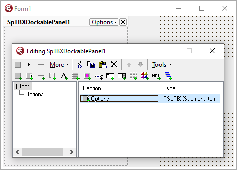
TSpTBXCustomToolWindow - TSpTBXCustomDockablePanel - TSpTBXDockablePanel
Description:
TSpTBXDockablePanel is a fully customizable DockablePanel component with toolbar items support, you can add TB2K items. It supports unicode, custom painting events and has skin type selection, it can render skins and WinXP themes (without using a manifest).
To add/edit/delete items just double-click the component in the form designer to invoke the Item Editor. In addition to TB2K and SpTBXLib built-in items, regular controls may also be placed. Simply drop them on the component the same way you would on any other control.
It adds the following methods, properties and events:
Public:
- function Maximize: Boolean;
Maximizes the DockablePanel.
- function Maximized: Boolean;
Returns True if the DockablePanel is maximized.
- function Minimize: Boolean;
Minimizes the DockablePanel.
- function Minimized: Boolean;
Returns True if the DockablePanel is minimized.
- function Restore: Boolean;
Restores the DockablePanel.
- function SizeToggle(ToMaximize: Boolean): Boolean;
Minimizes or maximizes the DockablePanel.
- property CaptionPanelSize: TPoint;
Read only property that specifies the caption panel area size.
- property FloatingClientWidth: Integer;
Determines the width of the floating DockablePanel.
- property FloatingClientHeight: Integer;
Determines the height of the floating DockablePanel.
- property EffectiveWidth: Integer;
Determines the width of the DockablePanel.
- property EffectiveHeight: Integer;
Determines the height of the DockablePanel.
- property View: TTBToolbarView;
Access to the TTBView component that the control uses to render the items on the screen.
Published:
- property DefaultDockedSize: Boolean;
When the DockablePanel is being docked on an empty MultiDock it will use the
DefaultDockedSize property to set its size.
If DefaultDockedSize is 0 it will use the floating size.
- property Images: TCustomImageList;
Provides a list of icon images to display for each item in the control.
- property Items: TTBRootItem;
DockablePanel items.
- property FixedDockedSize: Boolean;
Determines if the dockable panel is resizable when docked.
- property Options: TSpTBXDockablePanelButtonOptions;
Use the Options property to show/hide the default DockablePanel buttons: Caption, Minimize, Maximize, Close.
- property ShowCaption: Boolean;
Determines if the caption area is visible when the DockablePanel is floating.
- property ShowCaptionWhenDocked: Boolean;
Determines if the caption area is visible when the DockablePanel is docked.
- property ShowVerticalCaption;
This property is used to rotate the caption panel vertically.
When the DockablePanel is floating or docked on a vertical
MultiDock the caption will be horizontal regardless of the
value of ShowVerticalCaption.
- OnDrawCaptionPanel (Sender: TObject; ACanvas: TCanvas; ARect: TRect; const PaintStage: TSpTBXPaintStage; var PaintDefault: Boolean);
Occurs when the control needs to be painted, the PaintStage indicates the current stage in the drawing process. DefaultDraw indicates whether the control should continue with the default painting after the event handler exits. Set DefaultDraw to false to prevent the drawing of the control after the event handler exits. If DefaultDraw remains set to true, the control continues with the default painting process.
More info on custom painting events
- OnWindowStateChanged (Sender: TObject; AWindowState: TWindowState);
Occurs when the DockablePanel gets minimized,
maximized or restored.
|
Unit:
SpTBXTabs
Hierarchy:
TCustomControl - TSpTBXCompoundItemsControl - TSpTBXCustomTabSet - TSpTBXTabSet
Description:
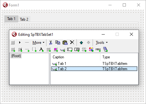
TSpTBXTabSet is a fully customizable TabSet component with toolbar items support, you can add TB2K items. It supports unicode, custom painting events and has skin type selection, it can render skins and WinXP themes (without using a manifest).
To add/edit/delete items just double-click the component in the form designer to invoke the Item Editor. In addition to TB2K and SpTBXLib built-in items, regular controls may also be placed. Simply drop them on the component the same way you would on any other control.
To add a tab to the control insert a TSpTBXTabItem.
It adds the following methods, properties and events:
Public:
- function Add (ACaption: WideString): TSpTBXTabItem;
Adds a tab to the control.
- function Insert(NewIndex: Integer; ACaption: WideString): TSpTBXTabItem;
Inserts a tab to the control.
- function DrawBackground(DC: HDC; ARect: TRect): Boolean;
Draws the background to a canvas.
- function GetTabSetHeight: Integer;
Gets the tabs height.
- procedure MakeVisible(ATab: TSpTBXTabItem);
Scrolls the tabset, if necessary, to ensure a Tab is in view.
- procedure ScrollLeft;
Scrolls to the previous tab.
- procedure ScrollRight;
Scrolls to the next tab.
- procedure ScrollState(out Left, Right: Boolean);
Specifies if it can scroll to the previous and the next tabs.
- procedure TabClick(ATab: TSpTBXTabItem);
Clicks the specified tab item.
- property Canvas;
Provides access to the drawing area of the control.
- property Toolbar: TSpTBXTabToolbar;
Access to the toolbar component that the control uses to render the tab items.
Published:
- propety ActiveTabIndex: Integer;
Determines the index of the tab in the list of items maintained by the control. The first (leftmost) tab has an index of 0, the next has 1, and so on. If no tabs are selected, ActiveTabIndex has a value of -1. Set ActiveTabIndex to programmatically change the selected tab in the tab control.
- property Images: TCustomImageList;
Provides a list of icon images to display for each item in the control.
- property Items: TTBRootItem;
TabSet items.
- property TabAutofit: Boolean;
When TabAutofit is true the tabs are resized to fit the tabset.
- property TabAutofitMaxSize: Integer;
Specifies the maximum size the tabs should have when TabAutofit is true.
- property TabBackgroundColor: TColor;
Determines the background color of the TabSet control. Use TabBackgroundColor to indicate the color that the tab set control uses to paint the area between the tabs and the border of the control.
- property TabBackgroundBorders: Boolean;
Determines if the tabs area is painted with borders.
- property TabCloseButton: Boolean;
Determines the visibility of the close button on the tab items.
- property TabCloseButtonImageIndex: Integer;
The ImageIndex to use or -1 if the item has no image.
- property TabDragReorder: Boolean;
When TabDragReorder is true it allows tabs reordering with mouse drag & drop.
- property TabMaxSize: Integer;
The maximum size tab items can have.
- property TabPosition: TSpTBXTabPosition;
TSpTBXTabPosition = (ttpTop, ttpBottom);
Determines the TabSet alignment. When TabPosition is ttpTop the tabs are aligned to the top of the control, when TabPosition is ttpBottom the tabs are aligned to the bottom.
- property TabVisible: Boolean;
Determines whether the tabs are visible or not.
- OnActiveTabChange (Sender: TObject; TabIndex: Integer);
Occurs when the active tab index is changed.
- OnActiveTabChanging (Sender: TObject; TabIndex, NewTabIndex: Integer; var Allow: Boolean);
Occurs when the active tab index is about to be changed.
- OnActiveTabReorder (Sender: TObject; TabIndex: Integer);
Occurs when the active tab is reordered with mouse drag & drop.
- OnActiveTabReordering (Sender: TObject; TabIndex, NewTabIndex: Integer; var Allow: Boolean);
Occurs when the active tab is about to be reordered with mouse drag & drop.
- OnDrawBackground (Sender: TObject; ACanvas: TCanvas; ARect: TRect; const PaintStage: TSpTBXPaintStage; var PaintDefault: Boolean);
Occurs when the control needs to paint the background, the PaintStage indicates the current stage in the drawing process. DefaultDraw indicates whether the control should continue with the default painting after the event handler exits. Set DefaultDraw to false to prevent the drawing of the control after the event handler exits. If DefaultDraw remains set to true, the control continues with the default painting process.
More info on custom painting events
- OnTabClick (Sender: TObject; ATab: TSpTBXTabItem);
Occurs when a tab is clicked or when the ActiveTabIndex is changed.
|
Unit:
SpTBXTabs
Hierarchy:
TCustomControl - TSpTBXCustomTabSet - TSpTBXTabControl
Description:
TSpTBXTabControl is a fully customizable multipage TabSet component with toolbar items support, you can add TB2K items. It supports unicode, custom painting events and has skin type selection, it can render skins and WinXP themes (without using a manifest).
To add/edit/delete items just double-click the component in the form designer to invoke the Item Editor. In addition to TB2K and SpTBXLib built-in items, regular controls may also be placed. Simply drop them on the component the same way you would on any other control.
To add a tab to the control insert a TSpTBXTabItem, for every tab item a TabSheet is created where you can drop the controls related to that page.
TSpTBXTabControl inherits many properties, methods, and events from TSpTBXTabSet; see its help topic for details on the properties, methods, and events not listed here.
Public:
- function GetPage(Item: TSpTBXTabItem): TSpTBXTabSheet;
Returns the tabsheet linked to the specified tab item
- property ActivePage: TSpTBXTabSheet;
The active tabsheet
- property Pages[Index: Integer]: TSpTBXTabSheet;
Read only property that lists all the tab sheets on the control.
- property PagesCount: Integer
Read only property that returns the tabsheet count.
|
Unit:
SpTBXItem
Hierarchy:
TCustomControl - TSpTBXCustomStatusBar - TSpTBXStatusBar
Description:
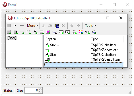
TSpTBXStatusBar is a fully customizable status bar component with toolbar items support, you can add TB2K items. It supports unicode, custom painting events and has skin type selection, it can render skins and WinXP themes (without using a manifest).
To add/edit/delete items just double-click the component in the form designer to invoke the Item Editor. In addition to TB2K and SpTBXLib built-in items, regular controls may also be placed. Simply drop them on the component the same way you would on any other control.
To add a status panel just insert a TSpTBXLabelItem and a TSpTBXSeparator item.
It adds the following properties and events:
Public:
- property Toolbar: TSpTBXStatusToolbar;
Access to the toolbar used by the control to hold the items.
- property View: TTBToolbarView;
Access to the TTBView component that the control uses to render the items on the screen.
Published:
- property Images: TCustomImageList;
Provides a list of icon images to display for each item in the control.
- property Items: TTBRootItem;
StatusBar items.
- property SizeGrip;
Determines whether the status bar is resizable at runtime.
- OnDrawDockBackground (Sender: TObject; ACanvas: TCanvas; ARect: TRect; const PaintStage: TSpTBXPaintStage; var PaintDefault: Boolean);
Occurs when the control needs to paint the background, the PaintStage indicates the current stage in the drawing process. DefaultDraw indicates whether the control should continue with the default painting after the event handler exits. Set DefaultDraw to false to prevent the drawing of the control after the event handler exits. If DefaultDraw remains set to true, the control continues with the default painting process.
More info on custom painting events
|
Unit:
SpTBXItems
Hierarchy:
TTBPopupMenu - TSpTBXPopupMenu
Description:
TSpTBXPopupMenu extends TTBPopupMenu with an OnInitPopup event to setup the items before the popup is showed, it could be used for example to set the focus to an EditItem inside the popup.
Public:
- function PopupEx(X, Y: Integer; PopupControl: TControl = nil; ReturnClickedItemOnly: Boolean = False): TTBCustomItem;
An enhanced version of the Popup method that returns the item the user selected, or nil if the menu was dismissed with no selection. It also supports a pair of additional parameters:
PopupControl, when is set to a control the PopupMenu will be positioned according to the control coordenates.
ReturnClickedItemOnly, when set to False the OnClick event handler of the selected item will be invoked automatically. If True, the OnClick event handler will not be invoked; the selected item will merely be returned.
Published:
- property ToolBoxPopup: Boolean;
Determines if the popup items are rendered with toolbar style, for example use this property when you want to create a color-picker style popup using the TSpTBXColorPallette item.
- OnInitPopup (Sender: TObject; PopupView: TTBView);
Use this event to setup the items before the popup is showed.
|
Unit:
SpTBXFormPopupMenu
Hierarchy:
TPopupMenu - TSpTBXFormPopupMenu
Description:
TSpTBXFormPopupMenu is a fully customizable Popup component that can be linked to any control to popup or rolldown a custom Form.
Public:
- procedure Popup(X, Y: Integer);
Shows the PopupForm at the coordinates indicated by X and Y parameters.
- procedure PopupEx(X, Y: Integer; ForceFocus: Boolean); overload;
Shows the PopupForm at the coordinates indicated by X and Y parameters, when ForceFocus is true the PopupForm is focused.
- procedure PopupEx(PopupControl: TControl; ForceFocus: Boolean); overload;
Shows the PopupForm at the coordinates where PopupControl is placed, when ForceFocus is true the PopupForm is focused.
- property PopupForm: TCustomForm;
Form to be showed when the Popup is displayed.
Published:
- property BorderStyle: TSpTBXPopupBorderStyleType;
Specifies the border style, the border can be fixed or sizeable.
- property PopupFocus: Boolean;
Determines if the focus is set to the Popup when it is showed.
- property ShowShadows: Boolean;
Determines if the shadows are showed or not.
- OnClosePopup (Sender: TObject; Selected: Boolean);
Occurs when the
Popup is closed.
If the Selected parameter is true the popup was closed because a selection was made.
- OnPopupEx (Sender: TObject; var FormWidth, FormHeight: Integer);
Occurs when the Popup is opened. Use the FormWidth and FormHeight params to specify the popup window size.
|
Unit:
SpTBXMDIMRU
Hierarchy:
TComponent - TSpTBXMDIHandler
Description:
TSpTBXMDIHandler extends TTBMDIHandler with unicode support and items skinning.
TSpTBXMDIHandler and TTBMDIHandler are only designed to work with wrapped (ShrinkMode = tbsmWrap) menu bars. To right align the buttons set toolbar's FullSize to true.
TSpTBXMDIHandler inherits many properties, methods, and events from TTBMDIHandler; see its help topic for details on the properties, methods, and events not listed here. |
Unit:
SpTBXItems
Hierarchy:
TCustomControl - TSpTBXCompoundItemsControl - TSpTBXCompoundBar - TSpTBXCustomTitleBar
Description:
TSpTBXTitleBar is a fully customizable title bar component with toolbar items support, you can add TB2K items. It supports unicode, custom painting events and has skin type selection, it can render skins and WinXP themes (without using a manifest).
To add/edit/delete items just double-click the component in the form designer to invoke the Item Editor. In addition to TB2K and SpTBXLib built-in items, regular controls may also be placed. Simply drop them on the component the same way you would on any other control.
It adds the following properties and events:
Public:
- function GetClientAreaRect: TRect;
Returns the ClientArea rect.
- procedure ShowSystemMenu(ScreenPos: TPoint); virtual;
Opens the SystemMenu popup.
- property View: TTBToolbarView;
Access to the TTBView component that the control uses to render the items on the screen.
Published:
- property Active: Boolean;
Determines if the TitleBar is activated.
- property FixedSize: Boolean;
Determines if the TitleBar can be resized.
- property FullScreenMaximize: Boolean;
Determines if the TitleBar is maximized at fullscreen.
- property Images: TCustomImageList;
Provides a list of icon images to display for each item in the control.
- property Items: TTBRootItem;
TitleBar items.
- property Options: TSpTBXTitleBarButtonOptions;
Use the Options property to show/hide the default title bar buttons: Caption, Minimize, Maximize, Close, SystemMenu.
- OnDrawBackground (Sender: TObject; ACanvas: TCanvas; ARect: TRect; const PaintStage: TSpTBXPaintStage; var PaintDefault: Boolean);
Occurs when the control needs to paint the background.
More info on custom painting events
- OnDrawDockBackground (Sender: TObject; ACanvas: TCanvas; ARect: TRect; const PaintStage: TSpTBXPaintStage; var PaintDefault: Boolean);
Occurs when the control needs to paint the title bar caption area.
More info on custom painting events
- OnSystemMenuPopup (Sender: TObject; PopupView: TTBView);
Occurs when the SystemMenu popup is opened.
|
Unit:
SpTBXControls
Hierarchy:
TCustomControl
Description:
Base class used for all the SpTBXLib controls it supports unicode hints and captions and custom painting events, it adds the following properties and events:
Public:
- procedure GetSize(out TotalR, TextR, GlyphR: TRect);
Returns the size of the control, the size of the text and the size of the glyph.
- function GetTextFlags: Cardinal;
Returns the text flags used to paint the text.
- function GetGlyphSize: TSize;
Returns the size of the glyph.
- property MouseInControl: Boolean;
Read only property used to find out if the mouse is inside the control.
- property Pushed: Boolean read GetPushed;
Read only property used to find out if the control is being pushed.
|
Unit:
SpTBXControls
Hierarchy:
TSpTBXTextObject - TSpTBXCustomLabel - TSpTBXLabel
Description:
TSpTBXLabel extends TLabel with support for unicode hints and captions and custom painting events, it inherits many properties, methods, and events from TSpTBXTextObject; see its help topic for details on the properties, methods, and events not listed here.
Published:
- property Alignment: TAlignment;
TAlignment = (taLeftJustify, taRightJustify, taCenter);
Controls the horizontal placement of the caption. Set Alignment to specify how the caption is justified within the ClientRect of the control.
- property CaptionGlow: Boolean;
Specifies if the caption outline is painted or not.
- property CaptionGlowColor: TColor;
Specifies the caption outline color.
- property FocusControl: TControl;
Set FocusControl to the windowed control that should receive focus when the user presses the accelerator key specified by the label. Specify an accelerator key by preceding a character in the label text with an ampersand (&) and setting the ShowAccelChar property to true.
- property GlyphLayout: TSpGlyphLayout
TSpGlyphLayout = (ghlGlyphLeft,
ghlGlyphTop);
Determines the position of the glyph image.
- property Images: TCustomImageList;
Provides a list of icon images to display next to the caption.
- property ImageIndex: Integer;
Identifies the image that appears next to the caption.
- property LinkText: WideString;
Use the LinkText property to open a folder, execute an application or browse for a web site.
Some of the values that LinkText can execute are:
- mailto:name@name.com
- http://www.embarcadero.com
- ftp://www.embarcadero.com
- news://news.jrsoftware.org
- C:\Windows (opens a folder in Windows Explorer, use the LinkTextParams property to specify the parameters).
- Notepad.exe (runs an application, use the LinkTextParams property to specify the parameters).
Note: the control can execute unicode links and params, for example you can open a folder named with unicode text.
- property LinkTextParams: WideString;
Specifies the parameters to be passed to the LinkText property to execute the link.
- property LinkFont: TFont;
Specifies the font that is used when the mouse is over the control and LinkText is valid.
- property Underline: Boolean;
Indicates wether the the label is underlined.
- property UnderlineColor: TColor;
Specifies the color of the underline.
- OnDraw (Sender: TObject; ACanvas: TCanvas; ARect: TRect; const PaintStage: TSpTBXPaintStage; var PaintDefault: Boolean);
Occurs when the control needs to be painted, the PaintStage indicates the current stage in the drawing process. DefaultDraw indicates whether the control should continue with the default painting after the event handler exits. Set DefaultDraw to false to prevent the drawing of the control after the event handler exits. If DefaultDraw remains set to true, the control continues with the default painting process.
More info on custom painting events
- OnDrawCaption (Sender: TObject; ACanvas: TCanvas; ClientAreaRect: TRect; var ACaption: WideString; var CaptionRect: TRect; IsTextRotated: Boolean; const PaintStage: TSpTBXPaintStage; var PaintDefault: Boolean)
Occurs when the control needs to paint the caption, the PaintStage indicates the current stage in the drawing process. DefaultDraw indicates whether the control should continue with the default painting after the event handler exits. Set DefaultDraw to false to prevent the drawing of the control after the event handler exits. If DefaultDraw remains set to true, the control continues with the default painting process.
More info on custom painting events
- OnDrawHint (Sender: TObject; AHintBitmap: TBitmap; var AHint: WideString; var PaintDefault: Boolean);
Occurs when the control needs to paint the hint, AHintBitmap represents the hint canvas, it can change the size, font, and background colors. AHint is the hint text to be painted, and PaintDefault indicates whether the control should continue with the default painting after the event handler exits. Set DefaultDraw to false to prevent the drawing of the control after the event handler exits. If DefaultDraw remains set to true, the control continues with the default painting process.
More info on custom painting events
- OnGetImageIndex (Sender: TObject; var AImageList: TCustomImageList;
var AItemIndex: integer);
Occurs when the icon image is about to be displayed, use OnGetImageIndex to dynamically assign an ImageList and an ImageIndex to the control before it is displayed.
|
Unit:
SpTBXControls
Hierarchy:
TSpTBXTextObject - TSpTBXButtonControl - TSpTBXCustomCheckBox - TSpTBXCheckBox
Description:
TSpTBXCheckBox extends TCheckBox with support for unicode hints and caption and custom painting events, it inherits many properties, methods, and events from TSpTBXLabel; see its help topic for details on the properties, methods, and events not listed here.
Published:
- property AllowGrayed: Boolean;
Determines whether the check box can be in a “grayed” state. If AllowGrayed is set to true, the control has three possible states: checked, unchecked, and grayed. If AllowGrayed is set to false, it has only two possible states: checked and unchecked.
- property Checked: Boolean;
Specifies whether the control is checked.
- property State: TCheckBoxState;
TCheckBoxState = (cbUnchecked, cbChecked, cbGrayed);
Indicates whether the check box is selected, deselected, or grayed.
|
Unit:
SpTBXControls
Hierarchy:
TSpTBXTextObject - TSpTBXButtonControl - TSpTBXCustomRadioButton - TSpTBXRadioButton
Description:
TSpTBXRadioButton extends TTBXRadioButton with support for unicode hints and caption and custom painting events.
TSpTBXRadioButton inherits many properties, methods, and events from TSpTBXLabel; see its help topic for details on the properties, methods, and events not listed here.
Published:
- property Checked: Boolean;
Specifies whether the control is checked.
- property GroupIndex: Integer;
Use GroupIndex to separate radio buttons contained within the same windowed control container into several logical groups.
|
Unit:
SpTBXControls
Hierarchy:
TSpTBXTextObject - TSpTBXButtonControl - TSpTBXCustomButton - TSpTBXButton
Description:
TSpTBXButton extends TButton with support for unicode captions and custom painting events.
TSpTBXButton inherits many properties, methods, and events from TSpTBXLabel; see its help topic for details on the properties, methods, and events not listed here.
Published:
- property Bitmap: TBitmap;
Specifies the skin bitmap to be used to paint the button. The bitmap should have 4 states normal, hottrack, pushed, disabled.
For example:
- property BitmapTransparent: Boolean;
Specifies whether the Bitmap property is transparent, the transparent color is determined by the bottom-leftmost pixel of the bitmap image.
- property Cancel: Boolean;
If Cancel is true, the button’s OnClick event handler executes when the user presses Esc. Although an application can have more than one Cancel button, the form calls the OnClick event handler only for the first visible button in the tab order.
- property Checked: Boolean;
Specifies whether the control is checked.
- property Default: Boolean;
Determines whether the button’s OnClick event handler executes when the Enter key is pressed. Although an application can have more than one Default button, the form calls the OnClick event handler only for the first visible button in the tab order. Moreover, any button that has focus becomes the Default button temporarily; hence, if the user selects another button before pressing Enter, the selected button’s OnClick event handler executes instead.
- property DropDownArrow: Boolean;
Determines if an arrow icon is painted when DropDownMenu is used.
- property Flat: Boolean;
Determines whether the button has a 3D border when the mouse is not over the control.
- property GlyphLayout: TSpGlyphLayout
TSpGlyphLayout = (ghlGlyphLeft,
ghlGlyphTop);
Determines the position of the glyph image.
- property GroupIndex: Integer;
Use GroupIndex to separate buttons contained within the same windowed control container into several logical groups.
- property ModalResult: TModalResult;
Determines whether and how the button closes its (modal) parent form. Setting the ModalResult property is an easy way to make clicking the button close a modal form. When a button is clicked, the ModalResult property of its parent form is set to the same value as the button’s ModalResult property.
|
Unit:
SpTBXControls
Hierarchy:
TSpTBXTextObject - TSpTBXButtonControl - TSpTBXCustomButton - TSpTBXCustomSpeedButton - TSpTBXSpeedButton
Description:
TSpTBXSpeedButton extends TSpeedButton with support for unicode captions and custom painting events.
TSpTBXSpeedButton inherits many properties, methods, and events from TSpTBXButton; see its help topic for details on the properties, methods, and events not listed here. |
Unit:
SpTBXControls
Hierarchy:
TSpTBXTextObject - TSpTBXProgressBar
Description:
TSpTBXProgressBar is a fully customizable progress bar component, it supports unicode, transparency, custom painting events and has skin type selection, it can render skins and WinXP themes (without using a manifest).
TSpTBXProgressBar inherits many properties, methods, and events from TSpTBXLabel; see its help topic for details on the properties, methods, and events not listed here.
Published:
- property CaptionType: TSpTBXProgressCaption;
TSpTBXProgressCaption = (pctNone, pctDefault, pctPercentage, pctProgress);
Determines how the caption is painted.
- property Max: Integer;
Specifies the upper limit of the range of possible positions.
- property Min: Integer;
Specifies the lower limit of the range of possible positions.
- property Position: Integer;
Specifies the current position of the progress bar.
- property Smooth: Boolean;
Specifies whether the progress bar is smooth or segmented, this property only works when the ThemeType is thtNone.
- property Vertical: Boolean;
Specifies whether the progress bar is oriented vertically or horizontally.
|
Unit:
SpTBXControls
Hierarchy:
TWinControl - TTrackBar - TSpTBXTrackBar
Description:
TSpTBXTrackBar is a fully customizable track bar component, it supports transparency, custom painting events and has skin type selection, it can render skins and WinXP themes (without using a manifest).
TSpTBXTrackBar inherits many properties, methods, and events from TTrackBar; see its help topic for details on the properties, methods, and events not listed here.
Public:
- function MouseInThumb: Boolean;
Returns True if the mouse is over the slider of the track bar.
- procedure ForceRepaint;
Repaints the track bar.
Published:
- property TickMarks: TSpTBXTickMark
TSpTBXTickMark = (tmxBottomRight, tmxTopLeft, tmxBoth, tmxCenter);
Specifies the location of the tick marks.
- OnDrawChannel (Sender: TObject; ACanvas: TCanvas; ARect: TRect; const PaintStage: TSpTBXPaintStage; var PaintDefault: Boolean);
Occurs when the control needs to paint the channel part of the track bar.
More info on custom painting events
- OnDrawChannelTics (Sender: TObject; ACanvas: TCanvas;
X, Y: Integer; var PaintDefault: Boolean);
Occurs when the control needs to paint the channel tics of the track bar.
More info on custom painting events
- OnDrawThumb (Sender: TObject; ACanvas: TCanvas; ARect: TRect; const PaintStage: TSpTBXPaintStage; var PaintDefault: Boolean);
Occurs when the control needs to paint the slider of the track bar.
More info on custom painting events
|
Unit:
SpTBXControls
Hierarchy:
TCustomControl - TSpTBXCustomPanel - TSpTBXCustomSplitter - TSpTBXSplitter
Description:
TSpTBXSplitter is a fully customizable splitter component, it supports transparency, custom painting events and has skin type selection, it can render skins and WinXP themes (without using a manifest).
TSpTBXSplitter inherits many properties, methods, and events from TSplitter; see its help topic for details on the properties, methods, and events not listed here.
Public:
- function ValidateSplitControl(var SplitControl: TControl): Boolean;
Returns a valid SplitControl. The SplitControl is the control the splitter should resize.
- procedure ChangeSplitControlSize(NewControlSize: Integer);
Resizes the SplitControl.
- procedure InvalidateGrip;
Invalidates the grip
handle of the splitter.
- procedure Minimize;
Minimizes the splitter.
- procedure Restore;
Restores the splitter.
- procedure Toggle;
Minimizes or
restores the splitter.
- property GripRect: TRect;
Returns the grip handle rect of the splitter
- property Minimized: Boolean;
Returns true if the splitter is minimized.
- property MouseOverGrip: Boolean;
Returns true if the mouse pointer is over the grip handle.
- property Moving: Boolean;
Returns true if the splitter is being moved.
Published:
- property GripSize: Integer;
Specifies the grip handle size.
- property MinSize: Integer;
Specifies the minimum size, in pixels, of the panes on either side of the splitter.
- property ResizeStyle: TResizeStyle;
TResizeStyle = (rsNone, rsLine, rsUpdate, rsPattern);
Specifies the effect of moving the splitter.
- OnDrawBackground(Sender: TObject; ACanvas: TCanvas; ARect: TRect; const PaintStage: TSpTBXPaintStage; var PaintDefault: Boolean);
Occurs when the control needs to be painted, the PaintStage indicates the current stage in the drawing process. DefaultDraw indicates whether the control should continue with the default painting after the event handler exits. Set DefaultDraw to false to prevent the drawing of the control after the event handler exits. If DefaultDraw remains set to true, the control continues with the default painting process.
More info on custom painting events
- OnMoving (Sender: TObject; var NewSize: Integer; var Accept: Boolean);
Occurs when the splitter is being moved.
- OnMoved (Sender: TObject);
Occurs after the splitter was moved.
|
Unit:
SpTBXControls
Hierarchy:
TCustomControl - TSpTBXCustomPanel - TSpTBXPanel
Description:
TSpTBXPanel is a fully customizable panel component, it supports transparency, custom painting events and has skin type selection, it can render skins and WinXP themes (without using a manifest).
Public:
- procedure InvalidateBackground(InvalidateChildren: Boolean = True);
Invalidates the background of the control. If InvalidateChildren it recursively invalidates all the control childrens.
- property HotTracking: Boolean read FHotTracking;
Specifies whether the panel borders are being highlighted.
Published:
- property Borders: Boolean;
Specifies whether the panel borders are visible or not.
- property BorderType: TSpTBXPanelBorder;
TSpPanelBorder
= (pbrRaised,
pbrDoubleRaised,
pbrSunken,
pbrDoubleSunken,
pbrBumped,
pbrEtched,
pbrFramed);
Specifies the border type.
- property HotTrack: Boolean;
Specifies whether the panel borders are highlighted when the mouse passes over.
- property TBXStyleBackground: Boolean;
Use the TBXStyleBackground to paint a TBX style background.
- OnDrawBackground(Sender: TObject; ACanvas: TCanvas; ARect: TRect; const PaintStage: TSpTBXPaintStage; var PaintDefault: Boolean);
Occurs when the control needs to be painted, the PaintStage indicates the current stage in the drawing process. DefaultDraw indicates whether the control should continue with the default painting after the event handler exits. Set DefaultDraw to false to prevent the drawing of the control after the event handler exits. If DefaultDraw remains set to true, the control continues with the default painting process.
More info on custom painting events
|
Unit:
SpTBXControls
Hierarchy:
TCustomControl - TSpTBXCustomPanel - TSpTBXGroupBox
Description:
TSpTBXGroupBox is a fully customizable group box component, it supports unicode, transparency, custom painting events and has skin type selection, it can render skins and WinXP themes (without using a manifest).
Published:
- property Borders: Boolean;
Specifies whether the panel borders are visible or not.
- property BorderType: TSpTBXPanelBorder;
TSpPanelBorder
= (pbrRaised,
pbrDoubleRaised,
pbrSunken,
pbrDoubleSunken,
pbrBumped,
pbrEtched,
pbrFramed);
Specifies the border type.
- property TBXStyleBackground: Boolean;
Use the TBXStyleBackground to paint a TBX style background.
- OnDrawBackground(Sender: TObject; ACanvas: TCanvas; ARect: TRect; const PaintStage: TSpTBXPaintStage; var PaintDefault: Boolean);
Occurs when the control needs to be painted, the PaintStage indicates the current stage in the drawing process. DefaultDraw indicates whether the control should continue with the default painting after the event handler exits. Set DefaultDraw to false to prevent the drawing of the control after the event handler exits. If DefaultDraw remains set to true, the control continues with the default painting process.
More info on custom painting events
|
Unit:
SpTBXControls
Hierarchy:
TCustomControl - TSpTBXCustomPanel - TSpTBXCustomGroupBox - TSpTBXCustomRadioGroup - TSpTBXRadioGroup
Description:
TSpTBXRadioGroup is a fully customizable radio group box component, it supports unicode, transparency, custom painting events and has skin type selection, it can render skins and WinXP themes (without using a manifest).
TSpTBXRadioGroup inherits many properties, methods, and events from TSpTBXGroupBox; see its help topic for details on the properties, methods, and events not listed here.
Published:
- property Columns: Integer;
Specifies number of columns in the radio group.
- property ItemIndex: Integer;
Indicates which radio button in the group is currently selected.
- property Items: TTntStrings;
Lists the radio buttons in the radio group.
|
Unit:
SpTBXEditors
Hierarchy:
TEdit - TSpTBXUnicodeEdit - TSpTBXEdit
Description:
TSpTBXEdit is a fully customizable edit control, it supports unicode, custom painting events and has skin type selection, it can render skins and WinXP themes (without using a manifest).
TSpTBXEdit inherits many properties, methods, and events from TEdit; see its help topic for details on the properties, methods, and events not listed here.
Public:
- function AddEditButton(AAlign: TAlign = alRight; AWidth: Integer = -1): TSpTBXEditButton;
Adds a button to the edit control.
- function HasEditButton: Boolean;
Returns True if the edit has an edit-button.
- function MouseInControl: Boolean;
Returns True if the mouse is over the edit control.
Published:
- property Alignment: TAlignment
TAlignment = (taLeftJustify, taRightJustify, taCenter);
Controls the horizontal placement of the text. Set Alignment to specify how the text is justified within the ClientRect of the control.
- property HotTrack: Boolean;
Specifies whether the control borders are highlighted when the mouse passes over.
- OnDrawBackground(Sender: TObject; ACanvas: TCanvas; ARect: TRect; const PaintStage: TSpTBXPaintStage; var PaintDefault: Boolean);
Occurs when the control needs to be painted, the PaintStage indicates the current stage in the drawing process. DefaultDraw indicates whether the control should continue with the default painting after the event handler exits. Set DefaultDraw to false to prevent the drawing of the control after the event handler exits. If DefaultDraw remains set to true, the control continues with the default painting process.
More info on custom painting events
|
Unit:
SpTBXEditors
Hierarchy:
TEdit - TSpTBXUnicodeEdit - TSpTBXEdit - TSpTBXButtonEdit
Description:
TSpTBXButtonEdit is a fully customizable edit control, it supports unicode, custom painting events and has skin type selection, it can render skins and WinXP themes (without using a manifest).
TSpTBXButtonEdit inherits many properties, methods, and events from TSpTBXEdit; see its help topic for details on the properties, methods, and events not listed here.
Published:
- property EditButton: TSpTBXEditButton
EditButton is the attached button control.
|
Unit:
SpTBXEditors
Hierarchy:
TEdit - TSpTBXUnicodeEdit - TSpTBXEdit - TSpTBXSpinEdit
Description:
TSpTBXSpinEdit is a fully customizable edit control, it supports unicode, custom painting events and has skin type selection, it can render skins and WinXP themes (without using a manifest).
TSpTBXSpinEdit inherits many properties, methods, and events from TSpTBXEdit; see its help topic for details on the properties, methods, and events not listed here.
Published:
- property SpinButton: TSpTBXSpinButton;
SpinButton is the attached spin button.
- property SpinOptions: TSpTBXSpinEditOptions;
Property that holds the spin edit options, refer to TSpTBXSpinEditOptions for more info.
- property Value: Extended;
This property conains the numeric value displayed by the control in floaging point format.
When ValueType if set to evtInteger or evtHex, the Value property is automatically rounded to the nearest integer. In this case it may also be convenient to access the numeric value using the AsInteger property.
- OnValueChanged(Sender: TObject);
Occurs when the value property is changed.
|
Unit:
SpTBXEditors
Hierarchy:
TPersistent - TSpTBXSpinEditOptions
Description:
TSpTBXSpinEditOptions is a class used by the spin edit controls (TSpTBXSpinEdit and TSpTBXSpinEditItem) to hold the spin edit options.
Public:
- procedure ValueInc;
Increments the value using the Increment property.
- procedure ValueDec;
Decrements the value using the Increment property.
- property ValueAsInteger: Int64;
Specifies the Value as an integer.
Published:
- property Decimal: TDecimal
Number of digits after the decimal separator.
- property Increment: Extended;
Specifies the amount by which the Value property changes when one of the spin buttons is pressed or when either the up or down arrow key is pressed.
- property MaxValue: Extended;
Use MaxValue to limit the largest Value that can be entered.
- property MinValue: Extended;
Use MinValue to limit the smallest Value that can be entered.
- property MouseWheel: Boolean;
When set to True the mouse wheel increments or decrements the Value.
- property Postfix: WideString;
The string of characters which appears after the number. Use Postfix to display units, percentage, etc.
- property Prefix: WideString;
The string of characters which appears before the number. For example, prefix can be used to display currency symbols.
- property Value: Extended;
This property conains the numeric value displayed by the control in floaging point format.
When ValueType if set to evtInteger or evtHex, the Value property is automatically rounded to the nearest integer. In this case it may also be convenient to access the numeric value using the AsInteger property.
- property ValueSnap: Boolean;
Snap controls how the number is altered using the spin buttons. When the snapping is activated, the new Value after pressing the button is snapped to the grid with the step equal to Increment.
For example, consider the situation when the current Value is 0.32 and Increment is 0.1. When snapping is disabled, pressing the up button will change Value to 0.42, but with snapping the new Value will be 0.4. Correspondingly, pressing the down button in the first case, will change Value to 0.22, and with snapping it will be 0.2.
- property ValueType: TSEValueType;
TSEValueType = (evtInteger, evtFloat, evtHex);
Specifies the type of the value. This affects both displaying and editing of the number.
|
Unit:
SpTBXExtEditors
Hierarchy:
TEdit - TSpTBXUnicodeEdit - TSpTBXEdit - TSpTBXColorEdit
Description:
TSpTBXColorEdit is an edit control with a color selection button.
TSpTBXColorEdit inherits many properties, methods, and events from TSpTBXEdit; see its help topic for details on the properties, methods, and events not listed here.
Published:
- property SelectedColor: TColor;
Determines the currently selected color.
- property SelectedFormat: TSpTBXColorTextType;
TSpTBXColorTextType = (
cttDefault, // Use color idents (clWhite), if not possible use Delphi format ($FFFFFF)
cttHTML, // HTML format (#FFFFFF)
cttIdentAndHTML // Use color idents (clWhite), if not possible use HTML format
);
Determines how the SelectedColor is formated in the edit box.
- OnSelectedColorChanged(Sender: TObject);
Occurs when the SelectedColor property is changed.
|
Unit:
SpTBXEditors
Hierarchy:
TComboBox - TSpTBXComboBox
Description:
TSpTBXComboBox is a fully customizable edit control, it supports unicode, custom painting events and has skin type selection, it can render skins and WinXP themes (without using a manifest).
TSpTBXComboBox inherits many properties, methods, and events from TComboBox; see its help topic for details on the properties, methods, and events not listed here.
Public:
- function GetDropDownButtonRect: TRect;
Returns the Rect corresponding to the dropdown button.
- function GetMouseInDropDownButton: Boolean;
Returns True if the mouse is over the dropdown button.
- procedure InvalidateFrame;
Invalidates the control frame.
- property MouseInControl: Boolean;
Returns True if the mouse is over the edit control.
Published:
- property AutoItemHeight: Boolean;
Use this
to automatically calculate the ItemHeight property when the
Style is csDropDown, csDropDownList or csSimple.
- property HotTrack: Boolean;
Specifies whether the control borders are highlighted when the mouse passes over.
- OnDrawBackground(Sender: TObject; ACanvas: TCanvas; ARect: TRect; const PaintStage: TSpTBXPaintStage; var PaintDefault: Boolean);
Occurs when the control needs to be painted, the PaintStage indicates the current stage in the drawing process. DefaultDraw indicates whether the control should continue with the default painting after the event handler exits. Set DefaultDraw to false to prevent the drawing of the control after the event handler exits. If DefaultDraw remains set to true, the control continues with the default painting process.
More info on custom painting events
|
Unit:
SpTBXExtEditors
Hierarchy:
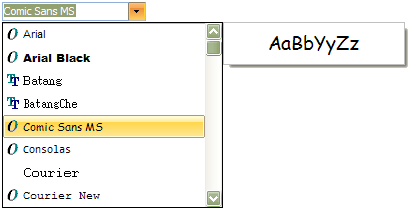
TComboBox - TSpTBXComboBox - TSpTBXFontComboBox
Description:
TSpTBXFontComboBox is a ComboBox that displays all the installed fonts on the system.
TSpTBXFontComboBox inherits many properties, methods, and events from TSpTBXComboBox; see its help topic for details on the properties, methods, and events not listed here.
Public:
- procedure MRUAdd(AFontName: TFontName);
Adds a new MRU font to the font list.
- function MRUDelete(AFontName: TFontName): Boolean;
Deletes a MRU font from the font list.
- property MRUCount: Integer read FMRUCount;
Returns the number of MRU fonts on the font list.
Published:
- property FontPreview: Boolean;
Determines if the Font Preview Panel has to be visible when the ComboBox is dropped down.
The Font Preview Panel is a small window that is placed at the right side of the ComboBox list that shows a small sample of the selected font.
- property FontNamePreview: Boolean;
Determines if the items of the ComboBox list are painted using the font that they represent.
- property MaxMRUItems: Integer;
Specifies the maximum MRU items the ComboBox should have.
- property SelectedFont: TFontName;
Determines the current selected font.
- OnFontPreview (Sender: TObject; var AText: WideString);
Occurs when the Font Preview Panel is showed, change the AText param to change the text sample that is used to show the selected font.
|
Unit:
SpTBXEditors
Hierarchy:
TListBox - TSpTBXListBox
Description:
TSpTBXListBox is a fully customizable listbox control, it supports unicode, custom painting events and has skin type selection, it can render skins and WinXP themes (without using a manifest).
TSpTBXListBox inherits many properties, methods, and events from TListBox; see its help topic for details on the properties, methods, and events not listed here.
Public:
- property HotTracking: Boolean;
Returns True if the mouse is over the control.
Published:
- property HotTrack: Boolean;
Specifies whether the control borders are highlighted when the mouse passes over.
- OnDrawItemBackground(Control: TWinControl; Index: Integer; Rect: TRect;
State: TOwnerDrawState);
Occurs when the items needs to be painted, the State indicates whether the item is selected, checked, focused, and so on.
More info on custom painting events
|
Unit:
SpTBXEditors
Hierarchy:
TCheckListBox - TSpTBXCheckListBox
Description:
TSpTBXCheckListBox is a fully customizable check listbox control, it supports unicode, custom painting events and has skin type selection, it can render skins and WinXP themes (without using a manifest).
TSpTBXCheckListBox inherits many properties, methods, and events from TCheckListBox; see its help topic for details on the properties, methods, and events not listed here.
Public:
- property HotTracking: Boolean;
Returns True if the mouse is over the control.
Published:
- property HotTrack: Boolean;
Specifies whether the control borders are highlighted when the mouse passes over.
- OnDrawItemBackground(Control: TWinControl; Index: Integer; Rect: TRect;
State: TOwnerDrawState);
Occurs when the items needs to be painted, the State indicates whether the item is selected, checked, focused, and so on.
More info on custom painting events
|
Unit:
SpTBXExtEditors
Hierarchy:
TListBox - TSpTBXListBox - TSpTBXColorListBox
Description:
TSpTBXColorListBox is a fully customizable listbox control that lets users select a color, it supports unicode, custom painting events and has skin type selection, it can render skins and WinXP themes (without using a manifest).
TSpTBXColorListBox inherits many properties, methods, and events from TSpTBXListBox; see its help topic for details on the properties, methods, and events not listed here.
Public:
- procedure AddColor(AColor: TColor; AColorName: string);
Adds a new color to the ListBox.
- function ColorCount: Integer;
Returns the color count.
- property Colors[Index: Integer]: TColor;
Use this property to get a color from a specified index.
- property ColorNames[Index: Integer]: string;
Use this property to get a color name from a specified index.
Published:
- property Selected: TColor;
Determines the selected color.
- property Style: TSpTBXColorListBoxStyles;
TSpTBXColorListBoxStyle = (
clbsStandardColors, // First 16 RGBI colors + 4 additional extended colors
clbsSystemColors, // System colors
clbsIncludeNone, // Include clNone color
clbsIncludeDefault, // Include clDefault color
clbsCustomColor, // First color is customizable
clbsPrettyNames, // Draw text with pretty names
clbsNoneAsTransparent // Draw clNone as transparent color
);
Determines how the ListBox is populated.
|
Unit:
SpTBXPageScroller
Hierarchy:
TWinControl - TSpTBXPageScroller
Description:
TSpTBXPageScroller serves the same purpose as standard TPageScroller and TScrollBox allowing access to child controls when the client area is larger than the window of the page scroller itself. However, there are some substantial differences in the way it is handled. For example, TSpTBXPageScroller allows having child controls with the Align property set.
Currently, the proper alignment of child controls can be obtained if their Align property is set to alTop, alClient, or alBottom for vertical page scrollers, and alLeft, alClient, or alRight for horizontal page scrollers. The further restriction is that only one control amongst children can have alClient alignment.
Public:
- property Position: Integer;
Specifies the scroll position of the page scroller.
Published:
- property AutoRange: Boolean;
When set to True the page scroller calculates the range of scrolling automatically.
- property AutoScroll: Boolean;
Controls how the scrolling is activated. If AutoScroll is set to True (default), the scrolling starts when the mouse cursor is hovered over a scroll button button. When AutoScroll is set to False, the button needs to be pushed.
- property ButtonSize: Integer;
The size of scrolling buttons. The scrolling buttons are visible only when Range exceeds the size of the control.
- property Margin: Integer;
Specifies the margin between the contained controls and the inside edges of the page scroller.
- property Orientation: TSpTBXPageScrollerOrientation;
TSpTBXPageScrollerOrientation = (tpsoVertical, tpsoHorizontal);
Defines the direction of scrolling.
- property Range: Integer;
Defines the range of scrolling. Setting range explicitly will also set AutoRange to False.
|
Unit:
SpTBXCustomizer
Hierarchy:
TComponent - TSpTBXCustomizer
Description:
TSpTBXCustomizer is a toolbar customizer component, it supports unicode, Drag and Drop and skins.
To add/edit/delete items just double-click the component in the form designer to invoke the Item Editor.
Public:
- procedure Close;
Closes the customizer form.
- procedure DeleteLayout;
Deletes the specified layout from an ini file or registry.
- procedure Load;
Loads the items and layouts from an ini file or registry.
- procedure LoadLayout
Loads a specified layout.
- procedure Reset;
Restores the default toolbar items position and customizer options.
- procedure Save;
Saves the items and layouts to an ini file or registry.
- procedure SaveLayout
Saves the current layout.
- procedure Show;
Shows the customizer form.
- procedure ShowEmbedded(AParent: TWinControl = nil);
Embeds and shows the customizer form. You can embed the customizer to another control, but the form of this control cannot be modal or the drag & drop will not work.
You also need to close the customizer explicitly by calling the Close method.
- property CustomizeForm: TSpTBXCustomCustomizeForm;
Gets the customizer form instance.
- property Layouts: TStringList;
Gets the layouts list.
- property Showing: Boolean;
Showing is true when the form customizer is visible.
Published:
- property MenuBar: TTBCustomToolbar;
The customizer uses this property to fill all the items shortcuts.
- property Images: TCustomImageList;
Provides a list of icon images to display for each item in the control.
- property Items: TTBRootItem;
Customizer items.
- property SaveFormState: Boolean;
When True it will save the form state to the ini file or registry.
- OnShow (Sender: TObject);
Occurs when the customizer form is showed.
- OnClose (Sender: TObject);
Occurs when the customizer form is closed.
- OnGetCustomizeForm (Sender: TObject; var CustomizeFormClass: TSpTBXCustomizeFormClass);
Use this event to replace the customizer form type.
- OnGetShortcutsList (Sender: TObject; AItem: TTBCustomItem; var Accept: Boolean)
Use this event to filter the Shortcuts list.
- OnLoad (Sender: TObject; ExtraOptions: TStringList);
Occurs when the items customizations are loaded from the ini file or registry.
- OnSave (Sender: TObject; ExtraOptions: TStringList)
Occurs when the items customizations are saved to the ini file or registry.
To load and store your custom data or options related to the application use the OnLoad and OnSave events:
procedure TForm1.SpTBXCustomizer1Save(Sender: TObject;
  LayoutName: String; ExtraOptions: TStringList);
begin
  // Save the Form's font size
  ExtraOptions.Values['FontSize'] := IntToStr(Font.Size);
end;

procedure TForm1.SpTBXCustomizer1Load(Sender:
TObject; LayoutName: String; ExtraOptions: TStringList);
var
  S: string;
begin
  // Restore the Form's font size
  S := ExtraOptions.Values['FontSize'];
  if S <> '' then
    Font.Size := StrToInt(S);
end; |
- OnLayoutLoad (Sender: TObject; LayoutName: string; ExtraOptions: TStringList);
Occurs when a layout is loaded.
- OnLayoutSave (Sender: TObject; LayoutName: string; ExtraOptions: TStringList);
Occurs when a layout is saved.
The layout is just the position and visibility of the toolbars and dockable panels, but you can store more options related to it.
To store custom data or options related to a specific layout use OnLayoutLoad and OnLayoutSave events:
procedure TForm1.SpTBXCustomizer1LayoutSave(Sender:
TObject;
  LayoutName: String; ExtraOptions: TStringList);
begin
  // Save the Form's WindowState
  ExtraOptions.Values['MyOption'] := IntToStr(Ord(WindowState));
end;

procedure TForm1.SpTBXCustomizer1LayoutLoad(Sender:
TObject; LayoutName: String; ExtraOptions: TStringList);
var
  S: string;
begin
  // Restore the Form's WindowState
  S := ExtraOptions.Values['MyOption'];
  if S <> '' then
    WindowState := TWindowState(StrToInt(S));
end; |
- OnIconOptionsChange (Sender: TObject; Toolbar: TTBCustomToolbar;
UseSmallImages: Boolean);
Occurs when the user changes the toolbar icon options in the customizer form.
- OnSkinChange (Sender: TObject)
Occurs when the theme is changed.
|
|
|
